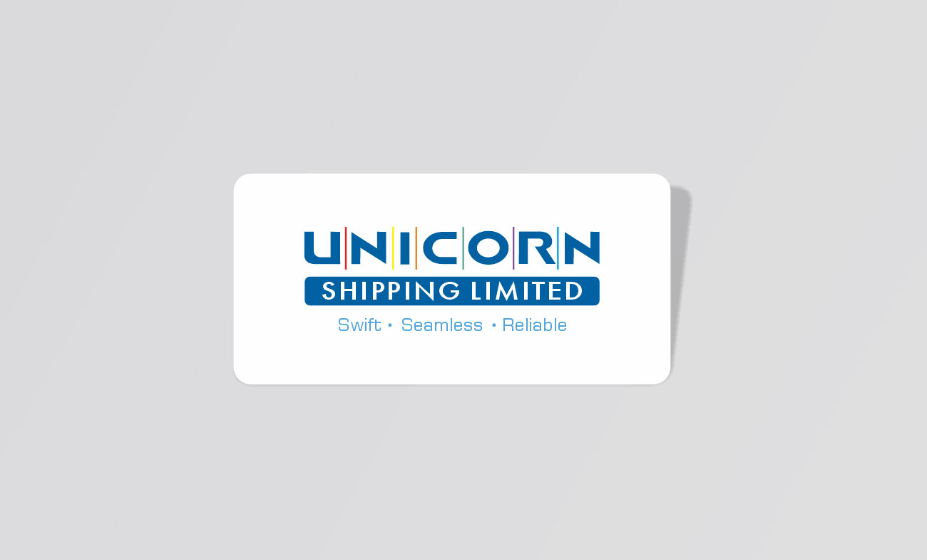
After 15 years, the company needed an identity that matched its growth and new direction. The refreshed logo keeps the original trust intact while giving the brand a sharper, more modern feel. The lines running through the wordmark represent the different services moving together – separate strengths, one seamless offering.